Ricerca
ISIA Roma
Rivaluta

STUDENTS
Natasha Artuso, Lorenzo Cortese, Luca Michele Grimaldi, Marta Limone, Alessia Mannola, Roberta Parisi, Marco Porpora, Agnese Prieto, Federico Rinaldi, Angela Russo, Adele Sorressa, Giorgia Susta, Laura Tumbarello.
TUTORS
Docenti: Massimiliano Datti, Alessandro Guariento, Mario Rullo. Tutor: Barbara Muratori.
The project defines a communication strategy to enhance and promote the new staging of Molière’s Miser, directed by Luigi Saravo, at the National Theater in Genoa.
The goal is to raise awareness about consumerism, the loss of values that we experience in our day, retraining the role of theater within the community and mending the torn relationship between theater and the city, to make Molière’s narrative contemporary.
The logo is designed with a specially redesigned serif font with “stencil” features to evoke the elegance of the theater. The design includes ligatures to emphasize the meaning of avarice and ink saving.
The prefix “RI” is highlighted to mark the renewal of the Miser, including through the payoff.
The ad’s campaign uses different communication styles to define the message: from Copy-Ad to oxymoron, it aims to question the audience’s certainties by guiding them toward a redefinition of their values.
The communicative language is impactful and declarative, to twist the narrative of avarice.
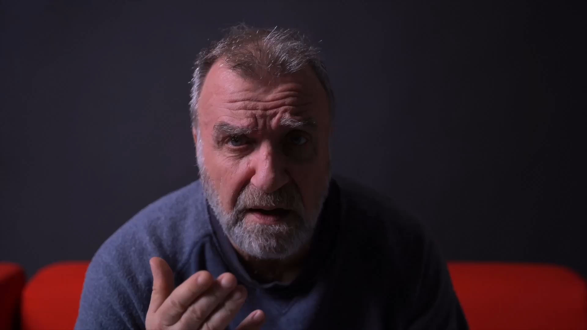
The project develops a video component that will be played before, during and after the performances. Accompanying the campaign narrative are a series of videos designed for both the website and a social media campaign, in which the actors themselves who will be performing in the theater will be featured, to engage even more with a wide audience of different ages.
Special thanks to Luigi Saravo.


