Il Deposi(to)
Design of the new identity of the Turin Labor Palace
Description
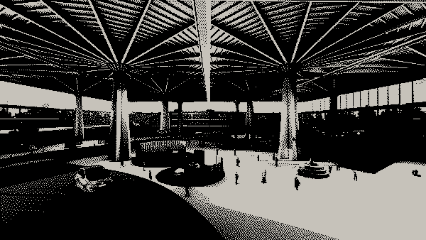
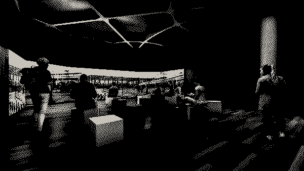
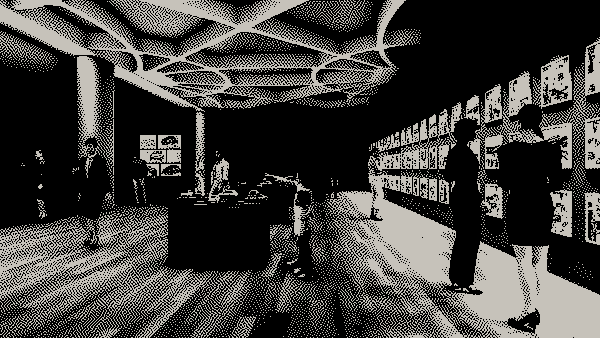
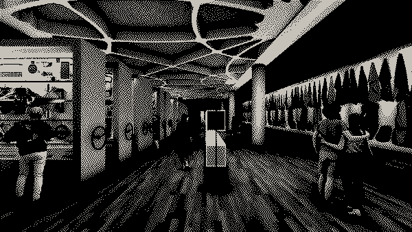
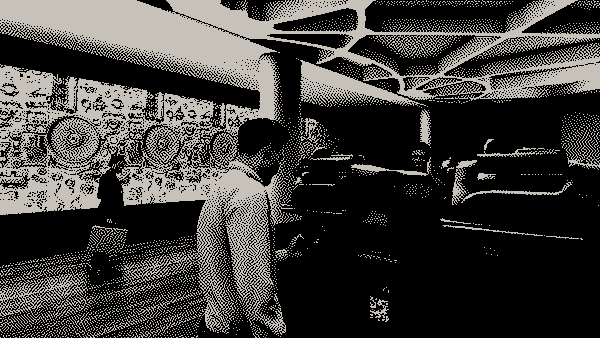
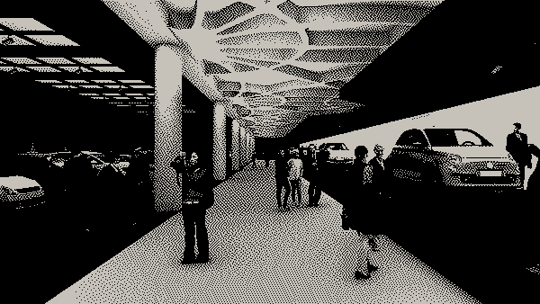
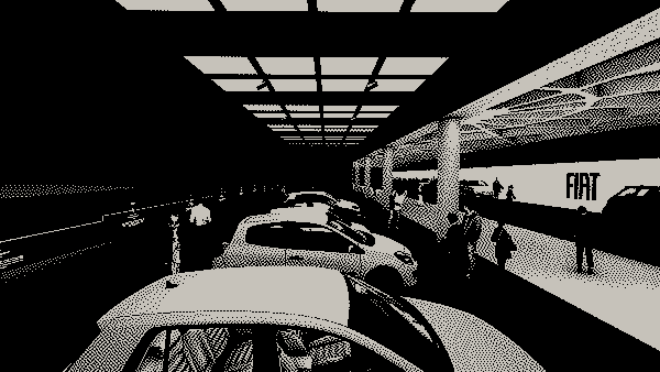
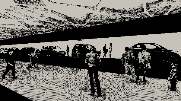
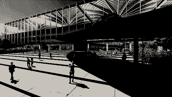
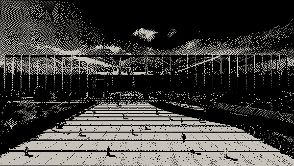
The thesis proposes the reuse of the Palazzo del Lavoro in Turin, a masterpiece of contemporary Italian architecture, designed by Pier Luigi Nervi in 1959 on the occasion of the Italia ‘61 event to celebrate the Centenary of Unification of Italy. It is a large architectural structure with a square plan side of 160 meters, characterized by a monumental internal space with 16 pillars that support the covering plates. The building, owned by the Cassa Depositi e Prestiti, has been for many years disused, it is today in a state of serious deterioration. Recently it was decided to intervene on the roofs to make them safe and waterproof them and yes a possible new use for the building is hypothesized: it could become the repository of all Turin’s museums becoming a “museum of museums”. Mara Zaccaria wanted to deal with this complex and unique site unusual size, studying its history and characteristics, investigating the theme of the reuse of large modern buildings, delving into the very current problem of MUSEUM DEPOSITS of which the Depot of Rotterdam is an emblematic example. Thanks to its planimetric flexibility, the Palazzo del Lavoro in Turin For the candidate it becomes an element capable of evolving with the context environment and respond effectively to changing needs throughout Some years. Therefore, the new Palazzo del Lavoro is conceived to offer a space multifunctional which develops on the ground floor but also on the upper floors with reading rooms, library, coworking, meeting and conference rooms, areas meetings, a bar/refreshment area and a bioclimatic greenhouse. To underline the value urban of the building the candidate proposes that one of the distinctive elements of the old project, the monorail that connected to the Palace, has a extension inside the building, an installation that invades the space exhibition and becomes an emblematic sign of the new project. The ground floor is dedicated to the display of Fiat’s heritage. The central area it is the most scenic one and displays a selection of the Fiat collection. There the perimeter gallery, on the other hand, is the part reserved for storage, a warehouse usable.The idea is to take visitors on an immersive journey, where they can walking among the iconic pillars of Pier Luigi Nervi and living at the same time an unusual museum experience, within the walls of a warehouse. Path exhibition will be divided into different thematic sections that tell the distinctive characteristics of the Fiat brand and its history. The rooms of the exhibition itinerary are organized following a sequence chronological, so as to expose the project phases in temporal order and making it easier to understand the history of the brand. The setup is characterized by flexible, linear and simple elements, and yes compares harmoniously with the important architecture of the building. Very the design of the displays is effective, both those assembled in the cabinets- storage to slide, both those that function as a backdrop or as a backdrop, yes It’s about contemporary wunderkammers full of information and surprises.
